

Our New Logo
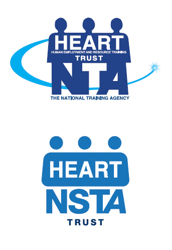
As HEART restructures; merging from four separate entities into one, our logo reflects this evolution as well, visually translating our entrance into a new era.
The new HEART logo is familiar and welcoming, drawing upon the heritage of our brand values, mark, typeface, and colours. However our symbol has been refreshed to reflect our foray into the new digital world, support the diversity of our institution, and represent the expansion of our offerings.
Being among Jamaica’s most recognizable icons the decision was made to evolve the logo, rather than extinguish the equity and recognition already built by our existing logo.
A warmer blue from the colour pallette has been utilized to improve visual appeal. A gradient transition has been incorporated to represent our transition to the digital age. Additionally, the “heads” were separated from the “body” of the logo to give our logo a more contemporary appearance.
How Do We Intend To Be Represented - Visual Guidelines
When utilizing our brand identity across various mediums, there are some guides to ensure we have represented appropriately.
The logo has two components:
1. The symbol – with multiple squares of colour, intended to symbolize the institution’s core.
2. The logotype which uses the Helvetica typeface.
The symbol and logotype must be present as part of the logo all times.
Give the logo space!
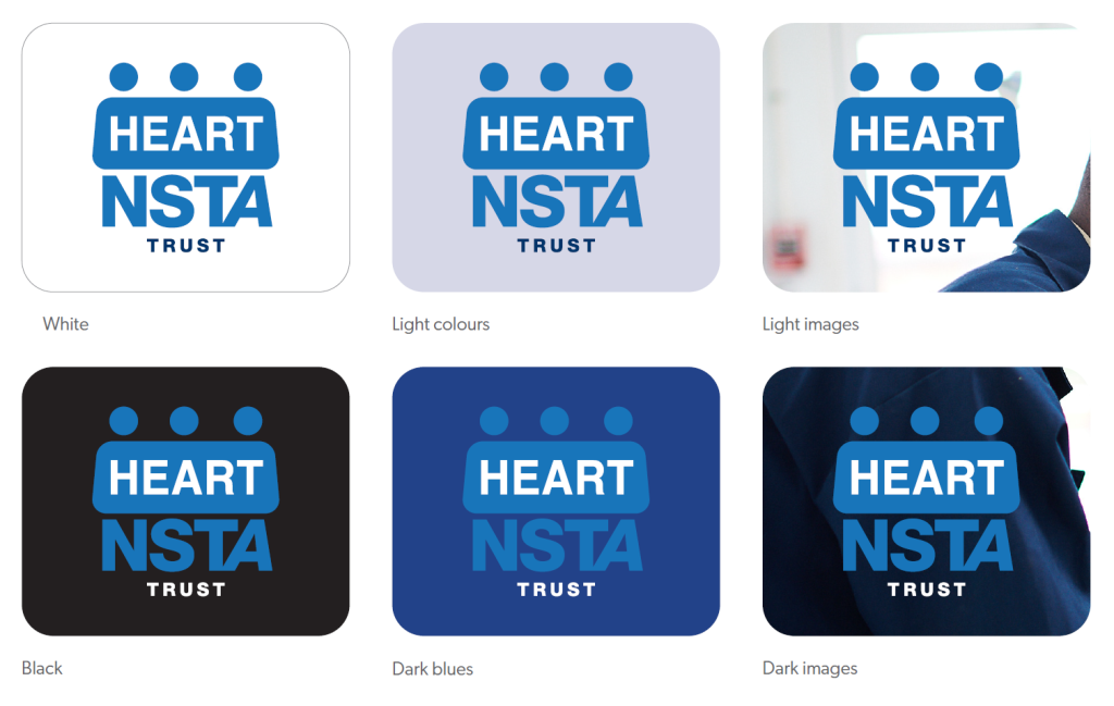
The logo must stand out clearly from its surroundings and backgrounds.
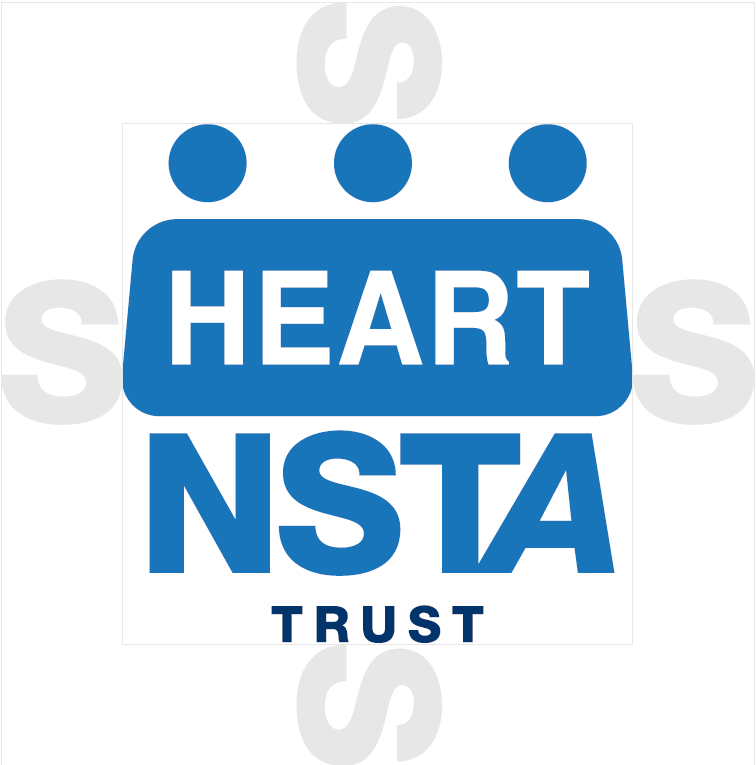
The minimum clear space that must surround the logo is equivalent to the width of the symbol’s negative space “S”. [See illustration]
The minimum size for the logo is 0.5in (13mm) wide on all printed material and 150 pixels (at 72dpi) for digital on-screen use. The logo should never be reproduced or appear any smaller than this size as this would compromise its legibility.
Logo Usage, Do's and Don'ts - Visual Guidelines (Cont'd)
When utilizing our brand identity across various mediums, there are some guides to ensure we have represented appropriately.
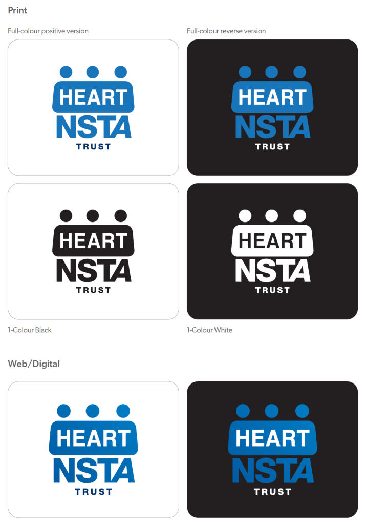
The full-colour positive version of the logo should be used whenever possible. However, the negative version of the logo may be used when the background is of the same colour as an element of the logo.
Alterations to the structure, colour,
proportions, elements or the direction of
the logo in any way is NOT allowed.
Don'ts

Do's
Our Brand Colour
HEART Trust Blue (Pantone 3005 C) is the main colour of the HEART identity so it has the strongest presence.
HEART Light Blue (Pantone 298C) complements the HEART Trust Blue, creating balance and making the palette more distinctive and sophisticated.
Download Branding & Visual Assets
We have curated a few templates and assets for media personnel to utilize when publicizing about the Trust. Please see the brand kit download button.